Monday, November 4, 2013

mCommerce – Why You Should Have a Mobile Site


mCommerce infographic
Click for larger view.
mCommerce – sales that take place over mobile devices like smartphones and tablets, is steadily increasing. In June of this year, 55% of all online sales originated on smartphones and tablets. And 71% of those polled said that their purchases, both online and brick and mortar began on a mobile device; this includes research of products and pricing, research of businesses that sell the products, location searches and on-site product price comparisons. What does all this mean? If you do not have a mobile presence, you are missing out on sales!

There is good news... getting a mobile presence does not have to be expensive and there is still time to get something set up before the holiday season!

Yes, developing a dedicated phone or tablet app can be expensive. But, in a recent survey, responders said that they prefer shopping on mobile websites rather than dedicated apps. And developing a mobile website does not have to be expensive because you have options.
  • Redesign your current site using the 'responsive web design' model. The responsive web design model uses techniques that allow you to create one site that works on many screen sizes. In the long term, this is probably the best idea for most businesses. But, it's the most expensive option and requires the most time.
  • Create a dedicated site for 'small screens' – those of smartphones, tablets, and phablets. (Phablets? A phablet is a device that has a screen larger than 5 inches but less than 6.9 inches – smaller than this is a smartphone and larger is considered a tablet. A popular example of a phablet is Samsung's Note III smartphone). If you want a site ready for the holiday season, this is your best bet. It is also less expensive than a complete redesign of your website.
  • Your final option is to do nothing and hope your site looks good on the plethora of connected mobile devices out there. But, unlike the early days of mobile websites, users are not willing to put up with sites that don't render well on mobile devices. Is this really a good option?

What does all this and the numbers in the accompanying infographic really mean? It means if you have a business that targets public consumers, you need a mobile presence. Mobile devices are getting more and more popular – they are currently outselling both desktop and laptop/notebook computers. Can you afford not to be in front of the customer's eyes when they want your product? The answer to that has always been NO.

Please contact us if you want/need a mobile friendly web presence: http://www.freelanceitsolutions.com

Please see infographic for sources.

Friday, November 1, 2013

Recently Completed Project for Disney


We recently completed a project for Disney. The project requirements:

  • Paper forms had to be reproduced as on-line forms. Every effort had to be made to make the on-line forms look like the paper forms, so that they would look familiar to the applicants.
  • Potential applicants would be required to pass an eligibility test to access the forms.
  • The system had to save form data so that applicants could come back to the forms as often as needed.
  • Once all forms are completed, applicant submit the forms, Disney personnel receives an email notification and applicants receive an email with instructions on how to continue the application process.
  • After the forms are submitted, PDF versions are generated. The PDFs must be available for Disney personnel and the applicant to view, download, and print.
  • The entire application had to be secure.

Login Screen

Thursday, August 22, 2013

Here's a cool little device...


Remember the movie "Minority Report?" Tom Cruise uses hand gestures to control the computer – scrolling through screens, bringing up data, zooming in on photos... it was all pretty cool, wasn't it?

We've seen new interfaces that give us the ability to control games with gestures and body motions. And now we are getting phones (Samsung’s Galaxy S4 for example) that have gesture recognition. The new comer on the scene gives you control over any computer with a USB port.

Leap Motion wants to replace your joystick, your mouse, even your keyboard with their motion-sensing device. It's about 12mm by 80mm small and uses your hand motions and finger gestures to interface with your computer. You can use it in place of game controllers, drawing tablets, the mouse, etc. And it costs a lot let than an XBox 360!

Link to Leap Motion: https://www.leapmotion.com/

Thursday, August 8, 2013

Landing Pages - The Successful Formula


You've probably heard the term – 'landing pages.' They're very big among marketers and your web programmer may have referred to them as well. But, what are they?

A landing page is a page on your website that you send visitors directly to for a specific reason / action. You might want them to,
  • Sign up for a newsletter.
  • Enter a contest.
  • Purchase your product or service (usually through some kind of sale or promotion).
  • Highlight a product or service.
  • Register for some 'free-be.'

The goal of all landing pages is to get the visitor to interact with your business somehow and eventually to make a sale.

Your landing page is your opportunity to showoff your products and services. You should pay very close attention to the design and content of these special pages.

Design First, Content Second and Always Optimize

A professional design MATTERS. In a recent study by Standford University, participants where asked to comment on what made a website credible to them. Nearly half (46%) of participants commented that the design was most important. Following design was information structure (29%), information usefulness (15%), information accuracy (14%) which tied with name recognition (14%), site functionality (9%), and customer service (6%). 

First impressions are important. And what the visitor sees first is the design. If your landing page is poorly designed, you loose half your visitors before you've even had a chance to give them your message. (That goes for your website as well).

So, use/create an outstanding design, then write informative and accurate copy, then optimize it for your audience.

Design and Content Fundamentals

Images – Spend Time and Choose Carefully
A picture is worth a thousand words. Studies have shown that visitors to websites look at pictures before they begin reading – even before they look at page headlines. We gravitate to pictures. Images are the best way to show your product or the results of your service. And although they are very important, they should also be used sparingly. It's not easy – the balancing act is to include enough images to keep your visitor interested without clutter. If you have more than one or two images that you would like to present, consider using an automatic slide show. This will allow the visitor to focus on one image at a time.

For landing pages, make sure you don't clutter up your page with images. Remember, the main reason you're bringing them to this page is to get them active.

Also, images take longer to download than text. The longer it takes for your page to load, the fewer visitors will stick around to see your message. Studies show that after five seconds, you start losing visitors. For every one second after five, you lose 7-10% of your visitors. So, if your page isn't loading material that will keep visitors interested, you're basically losing all your visitors in about 15 seconds!

Example Landing Page

Keep it Clean – The Minimalist Approach
The goal of your landing page is to keep your reader focused on the product/service. So keep the content – copy, links and images focused on the product/service. If it doesn't get the visitor emotionally involved, leave it out.

Most visitors are not going to spend a lot of time reading. So, keep your copy short. If you have a lot of information to convey, try using bullet points. If possible, let a picture 'do the talking.'

Links should only be included if they are absolutely necessary. For example, if you feel the visitor may need more info about the product/service, include a link. If you have a tutorial, include a link. The thing to remember here is that you do not want to give the visitor an 'escape route.'

There really should be only three ways to leave the page – get more info, buy or sign up, click the browser's back button.

Finally, leave plenty of white space. A cluttered landing page is confusing. White space give a sense of freedom... the visitor has time to think, he/she is not being pressured. You want to give them the feeling of comfort and easy. Visually show that your product/service is going to make their life easier.

Be Responsive
In non-work situations, more people now access the Internet with mobile devices, gaming consoles and TV interfaces than with computers. In 2013 about 15% of non-gaming, online sales will be made with mobile devices. Your landing page must be able to display on devices with different screen sizes and still look appealing and professional.

Use a professional web developer who understands and implements Responsive Web Design or you risk losing sales.

Keep it Familiar
If you have a 'standard layout' used with printed material or other online media, keep that layout. If there is an industry standard, try to stick to it. Unless these things horribly violate the standards above, you want to use them and keep things familiar for your visitors. Familiar is comfortable and you want to keep your visitors comfortable.

Call to Action

The call to action is the essential element of a landing page. As important as everything above is to a successful landing page, without a well thought out, attention grabbing call to action, you've wasted the change to gain a customer.

Stand Out
Action buttons like 'buy' or 'enter' should stand out. Studies show that these links and buttons should be of a contrasting color to the rest of the landing page. Also pay attention to the wording of action buttons. 'Enter to Win' will get more responses than simply 'Enter' or 'Submit.' Adding a short phrase to clarify the call to action can help convert visitors to customers as well.


Urgent
Don't let the visitor think this is going to be available forever (even if it is). Add a time limit for the offer and make it stand out. You may want to use a countdown timer that displays the days, hours, and minutes until the offer expires. Or include a calendar image with a big, red “X” over past (missed) days.

The key here is to include something to keep the visitor from thinking, “I'll come back to this later.” Studies have shown that more than 50% of visitors do not come back, even if they've indicated they plan to.

Keep it Simple...
Many times you will want to collect information from/about your visitor. Forms are a necessary part of many landing pages. The rule of thumb here is keep it simple. If your visitors feel it is too difficult or will take too long, they're not going to fill out the form. Collect the essential information you need and nothing more. Remember, even if you are getting minimal info here, you are getting info and can request more later. If they leave now, they're lost.

Your Call to Action
Now it's your turn. You can probably think of a product or service you would like to spotlight. Or perhaps a contest that will draw in potential customers. Jot down your ideas, give some thought to images and copy, contact a professional web developer and create your landing page(s)!

Comments Welcome
Leave comments below – let my blog readers know what's worked for you. Have you had a spectacularly successful landing page? How about a disaster? Share your experience.

Russ Thompson is the owner and lead developer at Freelance I.T. Solutions.

Tuesday, July 9, 2013

Beware of this Domain Name Renewal SCAM!


Do you own a domain name? Be careful of this scam. You may get this letter through the Postal Service or through email. This renewal is for a real domain, but the dates of registration are wrong and the amount they are charging for the service is WAY too much. When in doubt, login to your account with the company you registered the domain through, or give them a call to verify the renewal.


Monday, June 24, 2013

Understanding Web Development Jargon, Part 1 – Domain Name / Hosting / Website Development

In this series of posts, I hope to remove some of the mystery of getting a website up and running, as well as explain some of the jargon associated with websites. I plan to add a post in this series each week for the next few weeks. You are welcome to comment with questions, observations, etc.

Often when working with clients that are new to the whole website thing, we find that there is a lot of confusion on what it takes to get a website up and running on the Web – and even with clients that have worked with other developers in the past, there is often confusion.

This post will (hopefully) clear up what it takes to get a website up and running and viewable by the public. (These steps can actually be completed in any order. But, the order presented here is what is most often used).

First – purchasing the domain name. The domain name is what people type in their browser to get to your site... the .com thing (or .net or .org or several others – we'll get into that in another post in this series). You must purchase a domain name from a licensed registrar. The cost is usually around $9 USD to $12 USD for one year. (This can change greatly depending on the registrar you use. So, shop around). People often think that once they've purchased the domain name, they are ready to go – but they are not.

The domain name is only a name. It can not 'hold' a website. The domain name is just a 'title' that will later be used to tell computers where to go to view your actual website.

Wait a minute, wait. a. minute. We've already introduced a new term while trying to explain this one. What is a 'registrar?'

A registrar is a business that is licensed by the group that governs the Internet. They gather the information needed to register a domain and maintain a database of that information. That database is available to all other registrars and the governing body. The information that is collected – the domain name (obviously), the name and contact information of the person registering the domain name, and the length of time you will own the domain name. Some of the more common registrars are – Network Solutions (one of the first and most expensive), GoDaddy.com – you've probably seen their commercials (mid-level in terms of cost), and NameCheap.com (one of the least expensive).

You do not get your domain name forever. You must renew it – usually on an annual basis. But, you may purchase it for multiple years as well.

Second – host (a.k.a. host provider). When you hear developers talking about hosting, they are referring to space on a server where a website is stored. The host is the company that owns the server. And the hosting fee is the cost of renting the space on the server. The host can be the same as the registrar. Both GoDaddy.com and NameCheap.com will host websites for the domain names registered with them – for an additional fee. Fees paid for hosting are usually paid on an annual basis, although some hosts will allow for shorter lengths and most will allow for longer. And the fees can vary greatly, so again, shop around. And ask for explanations when they are more expensive – they may include extra services.

Normally, your host will also provide you with email addresses that use your domain name (address@yourdomain.com). If you think you are going to have a lot of email addresses, it's important to ask your host how many email addresses you get for the cost of hosting and how much each additional address will cost. Some providers will have limits, some will not. (Note here that some registrars also offer email services. If your host provider does not offer email services, this is an option. But, I would recommend using your host providers service when available. It makes everything easier for the setup of your domain and service. This has to do with technical stuff that is beyond the scope of this post).

Third – web development. This is when all the pretty stuff that people see and some behind the scenes stuff they don't see is created. Here again, there are options. If your needs are simple, you can create your own website using templates – often available from your registrar. Also some host providers will offer template programs you can use to set up your site. These programs will walk you through the creation of your site in steps that are supposed to be easy to understand – but often are not.

If you want a truly modern, interactive site you should contract with a developer or development company. A web developer will work with you to create a unique site (or at least it should be unique... if he/she/they are just using a template, are you really getting anything you couldn't do yourself)?

A good developer or company will discuss your needs, the impression you would like to give, and your target audience with you. A good developer will also help you to understand all of the above info and more. He/She will help you understand your responsibilities in the development process and explain to you what they are doing as they work through your project.

When choosing a developer, it is good to remember the old adage, “buyer be ware.” But, it's also important to remember, you often “get what you pay for.” You should ask to see the developer's portfolio and even ask for recommendations. Do a little research – look at their Facebook page, check Linked In for reviews, etc. While no company is going to make every single customer happy, you should see overwhelming good comments compared to bad before deciding to contract with a developer.

Finally, your developer can be local – someone you can meet with in person, someone on the other side of the world, or someone somewhere in between. The internet and telephones are global. There is no need to settle for someone you don't feel comfortable with or who can't provide the service(s) you want.

If you have any questions, comments, etc., please feel free to use the space below or contact us at questions@freelanceitsolutions.com. We will be happy to help you.

And by the way, Freelance I.T. Solutions offers all of the services mentioned here. ;-)

Thursday, June 13, 2013

Add a Count-Down Timer to Your 'Call-to-Action' Campaigns

Count down timers are a great way to add urgency to sales campaigns. We've created an application that you can add to your website or used on Facebook to setup and insert a counter.


View the demo here. You can purchase the app as-is or we can customize it for your needs.

Wednesday, June 5, 2013

Facebook Virus Draining Bank Accounts

Zeus, a six-year-old virus is going strong thanks to Facebook. From what I've read, Facebook is aware of the virus and is not taking it very seriously. So, it comes down to you – which really, it should.

Mac OS X and Linux users, at ease. Zeus targets only Windows operating systems.

The virus spreads through phishing messages. Usually, it is part of link or ad posted by a friend that suggests you checkout an ad or video. BE CAUSIOUS AND ONLY CLICK LINKS YOU ARE SURE ABOUT.

The virus sits quietly for a while doing nothing, until you log into a bank account. Once you've successfully logged in, it steals you id and password. Then later, drains your account.

The Zeus virus has been around since 2007 and is hosted on computers controlled in Russia.

The sophistication of this virus is, well, amazing. It may put up a duplicate of your banks page to make you think you are logging into your bank's real website. It has also been known to grab your social security number, which is then sold on the black market. Also, once the virus has you, it will send messages through social media and email, in your name, trying to spread to new computers.

Bottom line – be wary of all messages that say, 'checkout this video,' DON'T CLICK THE LINK, unless you are absolutely sure of it's origin.

Note: the videos are almost always real and funny / cute / scary – something to grab your attention. Because they are real, you won't have any idea you're infected.

Monday, June 3, 2013

Starting this week, Yahoo will be scanning your email (well, if you have a Yahoo account or are sending to someone with a Yahoo account). Yahoo says this is to serve you content appropriate ads and restrict abusive content. But if you don't want your email content scanned, ditch Yahoo.
http://techcrunch.com/2013/06/02/yahoo-shuts-down-mail-classic/

Saturday, May 11, 2013

Appointment / Scheduling Application

Recently we completed an online appointment system, which is part one of a three part application we are creating for a client in Portland, Maine. 

The application is a secure, password protected system used by the staff to keep track of appointments. It also tracks client information and develops reports based on that information.

This application is highly customizable. Beginning with the same base code, we can build a similar, customized application for your business.


The image below is a close up of the left side of the calendar display. In this image notice the 'date control' buttons. The left and right button will move one day, week or month; depending on the current calendar view. If you are not on the current day, the 'today' button will take you there in any view. The 'go to date' button...


will bring up this calendar. You can use it to quickly go to any day or month in any year.


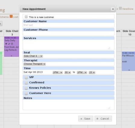
To create a 'new appointment,' simply click the starting time on the calendar. We can create a custom form to gather the information you need for your appointments. This image shows the form created for this client.

Clicking an appointment in any calendar view will bring up the 'edit appointment' form. Again this form can be customized to your needs. For this client, we pre-filled the 'new appointment' form. The form can be used to update/change any information for the appointment or also to delete the appointment.

Also notice in this close up image that the employees are each assigned a color. In the schedule, employees can quickly see which appointments are assigned to them. When customizing the scheduler application for you, colors could signify different types of appointments, different projects, different assignments – essentially, anything you need.

  In this close up view, note the four 'view' buttons. There are the three buttons familiar to most calendar systems – month, week, and day. (Screen shots of these views follow). Also notice the custom button 'seating.' This client needed to track appointments by their seating arrangement. Other possible custom view might be appointments by personnel, appointments by client type, or anything you may need.

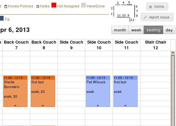
  As seen earlier, this is the 'seating' view for appointments. Business open and close time ranges can be set and, if needed, only those hours will be displayed. These hour settings are carried over to other views.

The 'week' view can be set to start on any day your business might use. For example, some businesses are closed on Mondays. In that case, this view can show the week starting on Tuesday. Another customization would be to remove weekends from this view.

When in the month view, the 'new appointment' and 'edit appointment' forms are available, as in the other views.


The 'day' view has all the same functionality of the other views.


In this close up image, notice the two, small lines at the bottom of the appointment. By clicking and holding, you can drag the end of the appointment up or down, changing the appointment ending time. You can also click and hold on the 'time header' of the appointment and move it. Doing this you can change the start time, the date, and (in this version) the seat of the appointment.

If you have a business that could benefit from an application like this appointment / schedule application, please contact Freelance I.T. Solutions by visiting our website or calling 407-259-2856.

Author: Russ Thompson (russ@freelanceitsolutions.com) - Freelance I.T. Solutions

Wednesday, April 17, 2013

SEO Tips for Image Optimization

A picture is worth a 1000 words... humans love to see pictures. We prefer pictures over text most of the time (which is why infographs are so popular, even when the don't tell us anything). And now, search engines love pictures as much as we do. Including the right information about pictures and images on your website can help boost your site in search results. Here are some tips to follow to take advantage of this feature.

1 – Use Keywords in File Names
It's pretty common knowledge that keywords are important in meta tags, page copy and URLs. It is less commonly known that search engine 'bots also look at image file names. Give your images descriptive names that are aligned with the copy / subject material on the page. A file name like “logo_75x75.jpg” tells the search engines nothing about your business or page subject. The file name “companyName_logo75x75.jpg” at least includes your company name and is one more thing for search engines to latch on to. It is extremely important that pictures of products have names that describe or match the product.

2 – Title Text
Have you ever noticed that when you leave your mouse over an image, often times a little message will pop up? This message is contained in an attribute called “title.” Search engines read these titles. Image titles should tell us something about the image/picture, but should also be related to the page copy. It's one more thing that 'show' search engines that your page is relevant to the search string being entered by the user.

3 – Alt Text
The 'alt' attribute is similar to the text attribute except that humans never see it unless there is a problem. 'Alt' stands for “alternate” and was set up to be used if an image could not be displayed. Have you seen words show up when an image does not load? What you see is the text in the alt attribute. Search engines use the information in the alt attribute to help determine what the image is about. Put a keyword or phrase in here that explains the image, is aligned with the page copy and is not the same as the title attribute text – it can be similar, but why wast the space on exactly the same text?

4 – Use the Right Images
Finding the right image can add a 'wow' effect to your page. Good images will encourage visitors to share your page and site – causing backlinks. Search engines like to see backlinks to sites. Backlinks mean people are finding what they are looking for on the site. This is very important to search engines because if their users are not finding relevant information through the search results, the users are going to try a different search engine. So, it's safe to say that a good image 'sells' your page.

It is also important to make sure your images are 1) owned by you, or 2) have public or Creative Commons licenses, or 3) are purchased for use on your page. Good places to look for images: Flickr, iStockPhoto, stock.xchng, and clip art catalogs. Or search Google using search terms like 'public license images' or 'Creative Commons images.'

5 – Images Should Match Page Content
The content or copy on the page should align with everything discussed so far – file names and URLs, meta tags, alt text, title text, and link text should all relate to page content.

A final note: do not over do it! Keep you keywords and phrases down to the essentials. Don't cram a lot of words and phrases into the tags and attributes in an attempt to score higher rankings. Too many words and phrases can 'confuse' the search engine bots and drop your ranking. Also, the search engine bots will only pick up so much and then the rest is ignored.

Author: Russ Thompson - Owner and Lead Programmer, Freelance I.T. Solutions